From ‘Fight Club’ to ‘Gone Girl’: Jeff Cronenweth’s Five Perfect Shots
Some folks don’t have a choice. Jeff Cronenweth sprung from cinema. His dad, Jordan Cronenweth, shot Blade Runner, Stop Making Sense, and the best bits of The Adventures of Buckaroo Banzai Across the 8th Dimension. From roaming his father’s sets, the younger Cronenweth absorbed his hunger for the lens. He crawled through crews, starting as a loader and camera assistant before coming face-to-face with David Fincher.
Cronenweth met Fincher when shooting pickups on the Madonna music video “Oh Father.” From there, he acted as a camera operator on Se7en and as the second unit cinematographer for The Game. The director eventually gave Cronenweth his first feature as director of photography on Fight Club, and since then, he’s helmed the frame on three more Finchers as well as visual banquets like Down With Love and Hitchcock.
The cinematographer is a bit of a chameleon. He’s responsible for some of this century’s most notorious shots, but he never bends a project to meet his style. Cronenweth shoots his films how they demand to be shot, adopting the right camera, lens, or ratio for the job.
What you will find in the five perfect shots below is variety. These frames are a mixed bag based on feeling. Cronenweth fires from the gut, happily adjusting technique to satisfy the specificity of any given story.
Fight Club (1999)
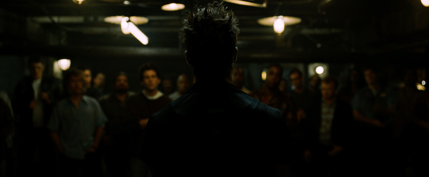
Selecting a single shot to represent Fight Club is excruciating. Fincher’s angry, mocking tirade against consumerism and masculinity is littered with frames worth celebration. Fight Club is the kind of film you reach out to touch; meanwhile, it returns the favor, touching you right back. Or, more likely, the movie slaps you across the face and pours lye upon your eyes — the image smolders, smells, and sours.
Fight Club is all texture. Shot on Super 35mm, the film requires a limited light source, allowing darkness to dominate without blinding the audience. Much of the movie is designed for wide angles, filling the image with an empty hollow emotion that amplifies the anxiety when crowds rush within the screen’s borders.
The above image occurs during the introductory bylaws speech: “The first rule of Fight Club is: you do not talk about Fight Club. The second rule of Fight Club is: you DO NOT talk about Fight Club!” While Brad Pitt, in the role of Tyler Durden, explains the parameters, Cronenweth’s camera moves behind the actor and halts for a second. Here, Durden is God.
Lou’s Tavern, where the basement brawls occur, is actually a 20th Century Studio stage where the cinematographer could control every flicker. Cronenweth wanted the audience to be aware of the crowd of extras brewing in the background, but he prevented us from locking onto their features. Everyone was lit by the hanging China-hat lamps and a few Kino Flo tubes that were hidden in the ceiling.
They’re sheep, while Durden’s silhouette is master.
One Hour Photo (2002)
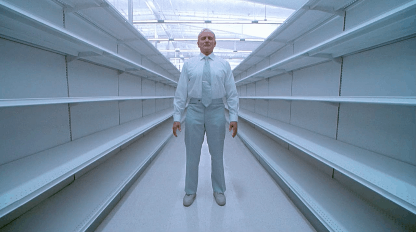
Where every inch of Fight Club holds a flavor and a coarseness, One Hour Photo burns with sterility. Robin Williams’ Sy
Parrish is a painfully isolated and fractured human being. He works as a photo technician for the big box store SavMart, and due to a traumatized childhood, he’s developed an obsession for the many bright family smiles he processes every day.
The movie stacks frames within frames, constructing a circle of tension. As we move through One Hour Photo‘s runtime, and Sy zeroes in on a particular household, we’re allowed more and more access into his nightmare interior. This shot depicts Sy frozen in his dreamscape. It follows a previous shot where the camera is planted much further down the corridor. The two are tied together by a fade, accentuating a tip-toe stillness. We do not belong here.
The aisles of SavMart are bleached pristinely white, their shelves barren. Sy stands erect, dressed in a suit that seals his color to that of his workplace. He and the building are one. Sy can’t move a muscle, but we can sense his molecules raging to burst forth.
The Shot fades into an extreme close-up where Sy can finally crack open his eyes and reveal the boiling blood behind them. Smash cut to a screaming, exploding red fountain version of Sy Parrish. It’s one of the most horrifying sequences of edits I’ve ever experienced.
The Social Network (2010)
After an eleven year gap, Cronenweth and Fincher reteamed for The Social Network. This time their collaboration yielded a film that feels more aligned with One Hour Photo‘s aesthetic than Fight Club’s shadow realm. This is not a story demanding grit or sloppy edges. The Social Network is a meticulously composed endeavor, seeking to surgically splay their Mark Zuckerberg (Jesse Eisenberg) on an operating table.
While Fincher had already graduated to shooting digitally, The Social Network was Cronenweth’s first feature to do so (he had previously shot music videos and commercials in this fashion). Using the RED One camera allowed Cronenweth to jam his crew into tight spaces, capturing the cramped environments of bars, dorms, and classrooms. The digital image is also immaculate, maximizing his sanitary approach.
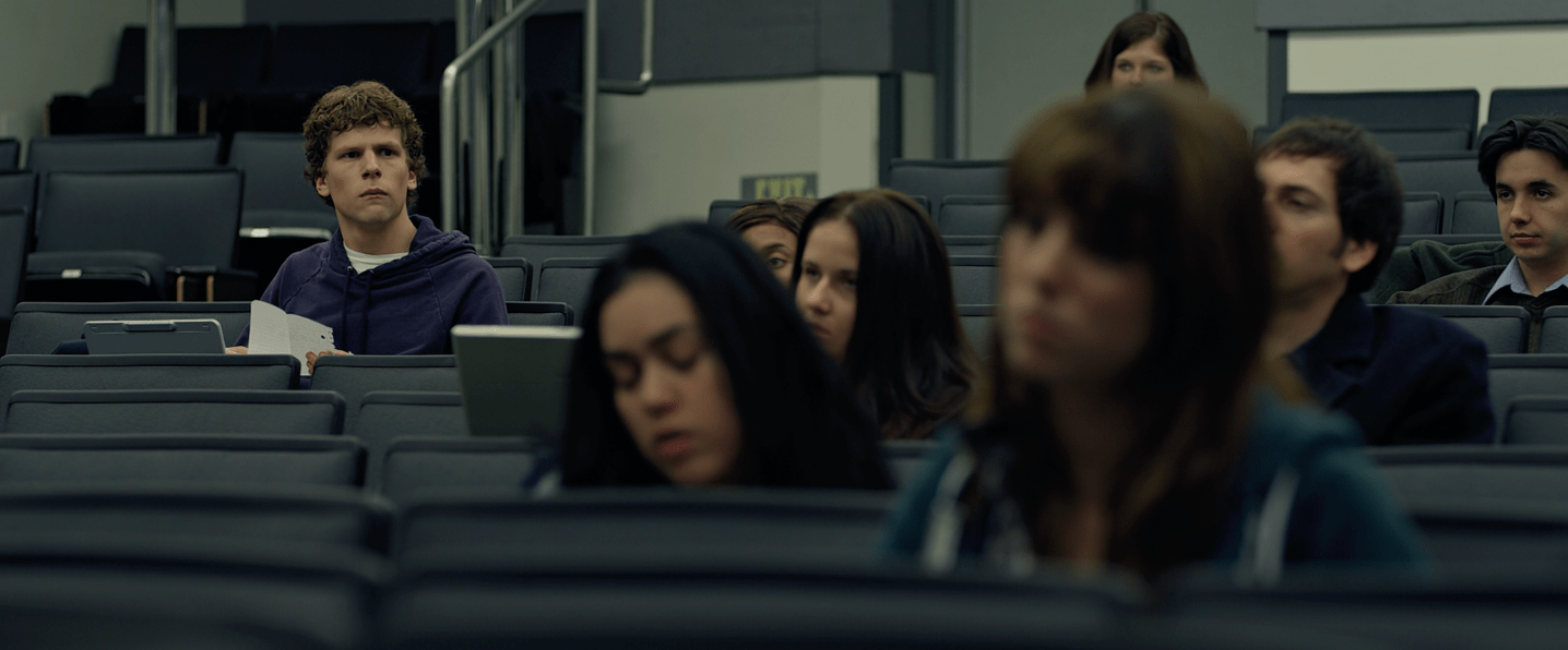
Most of The Social Network strives for symmetry. It’s the closest Fincher comes to aping Wes Anderson’s approach. Characters are anchored to the center of the frame, implying perpetual division. Eye to eye need not apply.
However, when Cronenweth disrupts the symmetry and embraces the rule-of-thirds as he does in the above shot, the impact hits all the harder. Here we see Zuckerberg cast aside from the rest of the class. He’s not so much recoiling as calculating the note he’s just received from the female student in the foreground: “You dick.” He’s played the school board, gained infamy, and awaits a legendary status, but he’ll never belong in the center of the frame. In the corner, like he is in this shot, is where he lives. Forever isolated from humanity.
Gone Girl (2014)
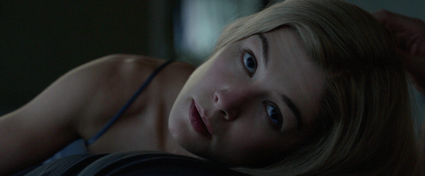
For Gone Girl, Fincher and Cronenweth chose the 6K RED Epic Dragon camera as their instrument. By taking in such tremendous data, the post-production team is gifted a previously unprecedented amount of leeway. Color correction? Stabilization? Resolution? Forget about it! No problem.
The post-production aspect is important because it frees the filmmakers to select the best shots from the best performances. The camera returns the power to the actor. As a psychological thriller, Gone Girl lives and dies on its characters — their words, faces, and movements.
Cronenweth opens the film on this incredible shot. Rosamund Pike’s soon-to-be-missing Amy slightly lifts her head from her husband’s chest as he strokes her hair and turns toward us, the audience. The fourth wall breaks, and we’re asked to penetrate her mind. What is her intent? The film takes us through the answer and closes on the mirror image to this first frame. By the climax, we have a better idea, but not a perfect one.
Tales From the Loop – Episode One: “Loop” (2020)
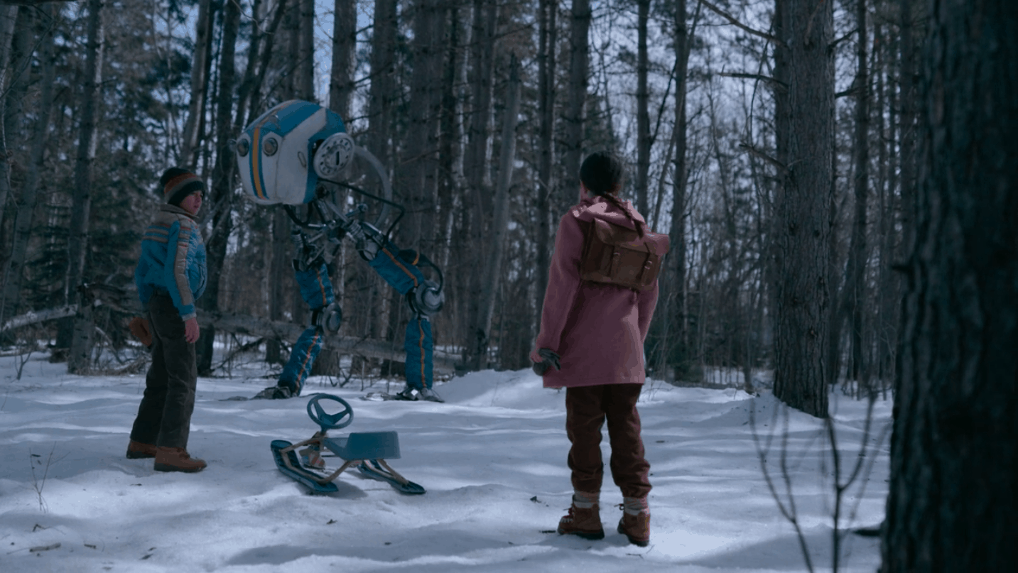
Tales from the Loop is an attempt by showrunner Nathaniel Halpern to replicate the paintings of Swedish artist Simon Stålenhag. His work is a confrontation between the idyllic and the technological. Are these metal monoliths an eyesore or the logical extension of this planet’s beauty?
Halpern turned to director Mark Romanek to kickstart his series with “Loop.” In return, the director sought his One Hour Photo collaborator Cronenweth. He had no interest in mimicking Stålenhag’s style, deciding to pull back on color and push the starkness of winter. What he saw in “Loop” was a touch of Ingmar Bergman and Krzysztof Kieślowski. Every movement necessitated intention. No willy-nilly.
As you see in this shot, the technology — the robot — hangs in the background. He pops as an image, but he also belongs. He’s as still as the trees that jail him. The children are the trespassers. They are the aggressors. They bring the energy and chaos to the frame.
What’s clear when you look at Jeff Cronenweth’s work is that he does not impose style over story. His art morphs to match the power of his scripts. No two look alike, but all are a rich environment to fall into. They’re not muddy, but they stick. Shaking their images proves preposterous. His films are in you for the long term.


