Remembering the Animation of Blue Sky Studios
This month, Disney announced it will be closing Blue Sky Studios, the 20th Century Fox animation division acquired during the 2019 takeover. The news drew immediate anger from the animation community, especially because the studio had only ten months of production left for its next picture, a feature-length adaptation of the fantasy webcomic Nimona. Further complicating the issue is the ever-looming presence of Disney’s rapidly encroaching monopoly over the entertainment and especially animation industries.
But today I’d like to celebrate the successes of Blue Sky Studios, which, for all its faults, remained a force of animation to the end, with outstanding art direction and a strong grasp on visual storytelling. The studio’s artists created work that was distinct and had great respect and love for the history of Western animation in particular. Let’s look back at the filmmaking of this once-great titan of animation.
Ice Age

By far Blue Sky Studios’ most financially successful endeavor, Ice Age was released in 2002, in the early days of CG animation. With a “journey” structure and a buddy-cop bent, the plot follows a trio of talking primitive mammals taking a human baby back to his early-human tribe. Revisited in 2021, this movie holds up shockingly well. The art direction, especially the backgrounds and character design, have an angular, almost expressionist quality to them that helps disguise the limitations of 2002 CGI rendering technology.
Despite these limitations, the characters still move fluidly and expressively in the film, which is directed by studio co-founder Chris Wedge and co-directed by Carlos Saldanha. The character animation is superb, especially considering the differences in the characters’ body types. Manny the wooly mammoth walks with a heavy, deliberate gait that makes him feel like the biggest character in every scene. Diego the smilodon is lithe and light-footed. Sid the sloth is clumsy and bumbling.
And yet, nowhere is a character more well-expressed than in Scrat, the silent mascot of Blue Sky whose slapstick antics run underneath the rest of the film. Scrat is like a Warner Bros. character brought to the modern age. He has a single, simple goal: get his acorn and store it for the winter. His pursuit of this goal leads him into situations of animated physical comedy that can be easily understood by anyone. Simple want, simple character, and simple comedy built on visuals with no need for dialogue.
This love for classic Western cartoons is present throughout all of the Ice Age films, and indeed all of Blue Sky’s films, even as the series begins to wear on and the writing begins to deteriorate. The key to the first film is motive: all three of the protagonists have different reasons for embarking on their journey together, leading to a strong tension that builds up as they inch closer to their goal.
Subsequent installments of the Ice Age franchise — the first two of them directed by Saldanha alone — lack this conflict of interest, leading to a rapidly expanding ensemble that never feels as genuine as the original trio. Nevertheless, the series maintains its love for classic Western animation and slapstick comedy throughout its five films and multiple Scrat-themed shorts.
Robots (2005)
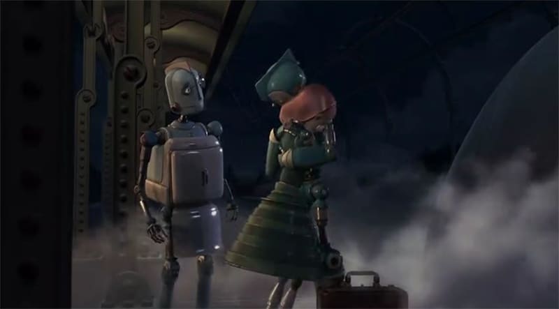
The second film from the studio — again directed by Wedge and co-directed by Saldanha — maintains the core strengths of the first: a distinct art style and expressive characters. The world of Robots has a 1950s technology aesthetic, and the film is a visual delight as a result. Sequences of gadgets and machinery move with the same efficient precision that makes industrial documentary footage and Iron Man suit-up sequences so satisfying to watch.
The robot characters live in a robotic world that is filled to the brim with fun and strange visual comedy, and the team at Blue Sky Studios mines it for everything it’s worth. But despite the comedic bent, it’s a movie with a lot of heart and a good bit to say about consumerism, classism, and self-image in the modern age.
The movie’s primary weakness is its overreliance on Robin Williams as comic relief. Robots is funny enough on its own merits, but the need to force in Williams’ character to make the most of the casting budget really drains dramatic tension, especially in later scenes. Furthermore, the morality tale does kind of fall flat when one recalls the Happy Meal tie-in and toys that this movie sold as part of its promotional campaign.
Despite that, Robots doesn’t feel old. The art style makes the visuals hold up, and the story’s relevance doesn’t seem to have aged a day. Like Ice Age, there’s a solid understanding of how to set up and pay off physical comedy that draws from the history of cartoons like the Looney Tunes and MGM shorts. And, of course, the animation fundamentals are robust and expressive. Robots is a forgotten masterpiece.
Dr. Seuss’ Horton Hears a Who! (2008)
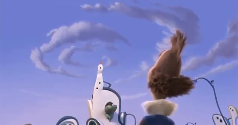
Blue Sky Studios’ second-best rated movie is an expanded Dr. Seuss adaption that, like Illumination’s The Lorax four years later, was tasked with taking a kindergarten reading level book of, at most, seventy-two pages, and turning it into a full-length feature film. And yet, Horton Hears A Who! really does work. The studio’s demonstrated excellence at physicality blends remarkably well with the Seussian aesthetic.
Robots art director Steve Martino was one of the directors of this picture (with former Pixar animator Jimmy Hayward), and he put the lessons he learned from that film into animating the bizarre architecture and strange machines that define the art of Dr. Seuss.
The author’s widow, Audrey Geisel, served as a supervising producer and allowed access to an archive of original drawings, material from the 1953 musical feature, and even memos to legendary animator Chuck Jones for the 1966 How The Grinch Stole Christmas TV special. Horton Hears A Who! really does look like a Dr. Seuss book brought to life, right down to the font choices. Even some of the jokes are written to rhyme or be otherwise vaguely Seussical. The movie also features a few short but distinct moments where the animation style changes, showcasing the filmmakers’ love for the medium.
Rio (2011)
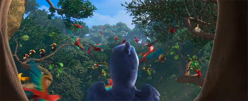
Rio opens with a musical number with the energy of a Disney renaissance film. It is visually stunning and sets up a spectacular adventure that did pretty well critically and at the box office. But just one year prior, Disney released Toy Story 3 and Tangled to an outstanding reception. And DreamWorks set their own new visual standard with How To Train Your Dragon. The turn of the decade saw animation as a whole trending toward what the technology could do to be more realistic, and with that came a decreased interest in the style of exaggerated expression and animated acting that characterized Blue Sky Studios’ strongest work.
Competition aside, Rio also suffers from its real-world setting. Blue Sky’s prior films distance themselves from reality, and the suspension of disbelief that allows the audience to believe a mammoth and a saber-toothed cat can team up to bring a baby across hundreds of miles of frozen tundra is the same level of suspension of disbelief required to accept that some of the antics they get into wouldn’t kill them. By integrating real-world settings and concerns, the slapstick becomes absurd.
Rio is further hampered by its reliance on celebrity stunt casting. This is something to which Blue Sky films were subject before, but as the method is strained, the flaws that were always there become more pronounced. And the 2014 sequel fails to fix any of these issues. Still, both Rio films were helmed by Saldanha, the first one being his first original IP in the director’s chair, and his love for his hometown of Rio de Janeiro oozes from these movies in the visuals, culture, and atmosphere.

The post Remembering the Animation of Blue Sky Studios appeared first on Film School Rejects.

